- Home
- Shows
- Days with Lorna Riley
- Take The Reading Test That Shows You What It’s Like To Be Dyslexic
Take The Reading Test That Shows You What It’s Like To Be Dyslexic
Loading...
-
1/3
 1/3
1/3 -
2/3
 2/3
2/3 -
3/3
 3/3
3/3 -
More Galleries
-
 Could you do the 3-day military diet to lose 5kg in three days?
-
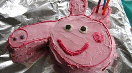
 Parents share their hilarious kids birthday cake fails
-
 International Women's Day: 11 things you might not know were invented by women
-
 Teenage heart throbs of the 80s: Where are they now?
-
 29 things every Kiwi kid will remember from the '80s
-
 Automatic 80s @ The Powerstation - Auckland
-
London designer Dan Britton has created a typeface that's intentionally difficult to read to simulate the problems faced by people with dyslexia.
Dan Britton feels that there is not enough awareness of the specific problems dyslexics encounter when reading text.
Using Helvetica as a base, the Dyslexia font removes around 40 per of the typeface's lines.
The aim is to make the average reader take their time when attempting to decipher the letters in the words and sentences.
According to Britton, while it isn't based on hard science, the typeface slows down someone reading it to the speed of someone with dyslexia reading normal font.
Can you read the 'dyslexic font'?
Source: http://danielbritton.info/195836/design


